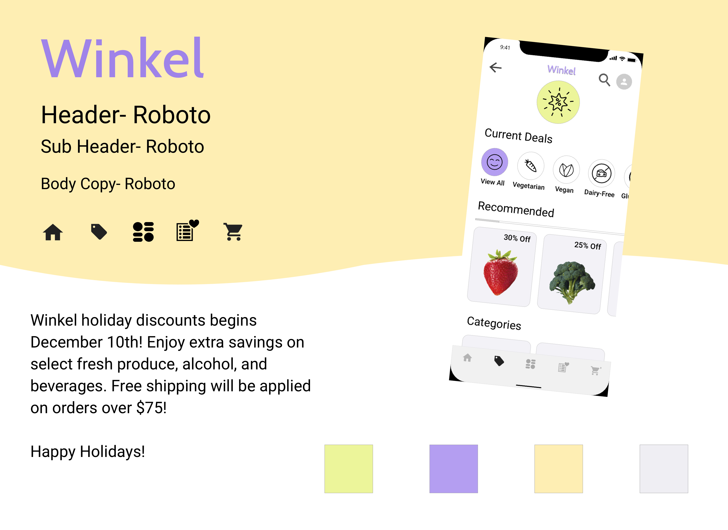
Winkel is a mock startup that aims to improve the way people shop for groceries online. They want to create a mobile-first experience that allows an user to buy what they need on the go.
This was a speculative design project I worked on within a 6 week timeline.
Role: UX/UI Designer
Tools: Sketch, InVision, Marvel
Skills: Competitive analysis, visual competitive analysis, prototyping, usability testing
Deliverables: Moodboards, wireframes, style tiles, high-fidelity mockups, prototypes
Should Winkel go mobile first?
In a study by the Food Marketing Institute conducted by Nielsen, online grocery sales are predicted to occupy 20% of total grocery retail by 2025. Amazon is currently leading the market with its share of 18% of the online grocery market (from a study by One Click Retail), while its closest competitor, Walmart, approximates half of Amazon’s market share. As Amazon has a strong online web presence and trends indicate a growth in mobile grocery app usage, going mobile-first may be a more convenient way for users to access Winkel and help identify Winkel as a quick and convenient solution for use on-the-go.
Barriers to Consider:
Some consumers may not trust the process of ordering fresh produce online.
According to a study by Nielsen:
Research into strategies such as guaranteeing a refund or same day product replacement could help curb these previous concerns.
Who are our competitors?
As research shows that the US online grocery shopping market is growing, I conducted a competitive analysis to take a closer look at the competitors within the market to gain a better understanding of the strengths and weaknesses of Winkel’s competitors, and identify areas of differentiation for Winkel’s strategic position.
Now that I had a better understanding of the current market and where there were points of differentiation for Winkel, I took a closer look at who our potential users were.
What are our user’s goals and needs? Why?
From 3 user interviews, I learned that:
To further pinpoint the main motivations, expectations, and goals of Winkel’s primary users, I developed a persona to help guide the design process by shifting the focus directly on the user.
Users who find that they do not have the time or energy to go grocery shopping can rely on Winkel to make the grocery shopping process more convenient for their lifestyles. They can grocery shop on-the-go, and make healthy food choices starting with the groceries they purchase. Taking into consideration our user’s partners/family and how they affect grocery shopping habits, a potential shared shopping experience could also be explored.
Keeping in mind our user’s goals:
I created sketches of concepts that help solve for our users goals and needs:
To get a better sense of how the user will move through Winkel, I developed an initial application map for Winkel. This helped me prioritize the main aspects/flows necessary for Winkel in relation to our user’s goals and needs.
Which direction?
Characterized by organic shapes and bright colours, the whimsical tone of this board is for the busy individual who wants to have a lighthearted approach to starting a healthy lifestyle for themselves.
Characterized by warm and earthy tones, the homey atmosphere of this board creates a wholesome feel for the user.
Based on the insights from our users and learnings from the visual competitive analysis, I decided to move forward with the “Whimsical, friendly, & approachable” design direction. This approach will visually differentiate Winkel from our competitors by providing a fresh take on the overused colour palette of medium-deep green hues. Winkel’s light lilac and lime green will promote a bright and optimistic mindset to beginning the journey of a healthy lifestyle to our users.
Based critique feedback on the initial screens, I made some alterations on various aspects of the screens to provide a better experience for the user.
Clearer confirmation to the user that an item has been added to their cart.
Originally, there was an option to search store within the screen page and also a search icon with in the top navigation. The double search option was redundant and unnecessary for the user, and may cause more confusion with the two options for the same search function.
The active/inactive colours seem unintuitive because typically, the the active button is darker in comparison to the inactive button.
After I decided on the design direction as well as the main concepts, I applied the visual considerations to the main concepts of Winkel.
(Please watch video walkthrough in 1080p)
Overall, two out of three users said they really enjoyed the aesthetics of the app design, including the icons and colours. The average rating of the aesthetics was 4.5 out of 5. Two out of three participants would continue to use this app and recommend it to someone else. All of the participants expressed that they would have liked to be able to click into more screens throughout the task list processes and explore more of the app.
After data collection, many points were identified that would help with the overall usability of Winkel. Overall, users would have liked to see more screens that they could click into. The screens within the User Profile navigation were not clickable, so they were not able to check on their preferences or get support if they needed.
Another issue that was brought up was a way to access the order they just placed. The user said that there was no way to access and track the order that they just placed through the prototype. Furthermore, another factor that was brought up involved the aesthetics of the app. One user found the icons of the app to be too stylized, while the other two users said they really enjoyed the icons chosen.